Sometimes it’s the little things that can make life easier. This post is actually a fork from the one which I originally wrote previously on a DPM issue. Shortly after that post, it was pointed out that I was reading DPM Priority Recommendations incorrectly. Indeed that was the case.
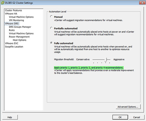
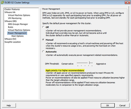
Where did I go wrong? Look at the priority descriptions between DRS and DPM, where both slide bars are configured with the same aggressiveness:
“Apply priority 1, priority 2, priority 3, and priority 4 recommendations”
“Apply priority 4 or higher recommendations”
My brief interpretation was that a higher recommendation meant a higher number (ie. priority 4 is a higher recommendation than priority 3). It’s actually the opposite that is true. A higher recommendation is a lower number.
I believe there is too much left open to interpretation on the DPM screen as to what is higher and what is lower. The DRS configuration makes sense because it’s clear as to what is going to be applied; no definition of high or low to be (mis-)interpreted. The fix? Make the DPM configuration screen mirror DRS configuration screen. Development consistency goes a long way. As a frequent user of the tools, I expect it. I view UI inconsistency as sloppy.
If you are a VMware DPM product manager, please see my previous post VMware DPM Issue.


The whole thing is wonky, when using the sdk if you set the power action rate to 2 it will result in setting the ui to level 4. Therefor the feature is consistent with DRS… The VIC team took it upon themselves to jacked this one up. Even after the explanation I still don’t agree with the UI.
I have a lot of experience with DPM. It is a great feature, but the controls are “OK” at best. Step 1, contrary to the test questions, DPM does N O T require WOL, and in fact I recommend turning it off if you can use a BMC, ie an iLO to do the heavy lifting. If you want the extra security blanket WOL provides, I suppose that is OK.
I don’t think the UI is inconsistent, the slider does TWO things. Power ons and power offs should be separately controllable, but they’re not. To me, more aggressive “power-savings” would power off more frequently and NOT power on as frequently. Thats just it, the slider is a double-edged sword, if it powers off more aggressively, it is just as aggresive to power on. A priority 5 recommendation would make power on and power off events much more frequent. Priority 1 recommendations never recommend power offs, so if you manually send a host to stand-by mode through the UI, it would take what some would consider a severe imbalance for it to power one on. Seemingly you would want the power on events at priority 1 to be faster, but it’s just the opposite.
The DPM threshold needs two sliders, one for power on and one for power off, so that the thresholds are separate. I know the engineers were in a conundrum on how to apply the thresholds so they make sense, but very obviously it is still counter-intuitive.
The DRS slider does the same thing as far as activity goes, I don’t see your point here. If you have it at priority 5, a 1 star recommendation will cause a vmotion. one star recommendations happen all the time… a 5 star recommendation I’ve only seen from putting a host in maintenance mode. Priority 5 DRS settings causes a FLURRY a vmotions, and a priority 5 DPM setting causes a flurry of power-on and power off events.
Brandon, I agree with your observation that the DPM Conservative/Aggressive slider needs 2 sliders for finer control of power on and power off situations. I’ve struggled with that as well and it’s a good discussion to add here in case the product manager visits.
It’s not just the UI itself either, the wording is terrible. You have to read it 3 times just to get your head around it.
Haha, I noticed this exact same issue! It made me a little uncertain as to what I was setting as well at first.